We are excited to share our new brand and website. Today’s launch is the first step of rolling out our new visual identity, something we’ve been working on for a few months.
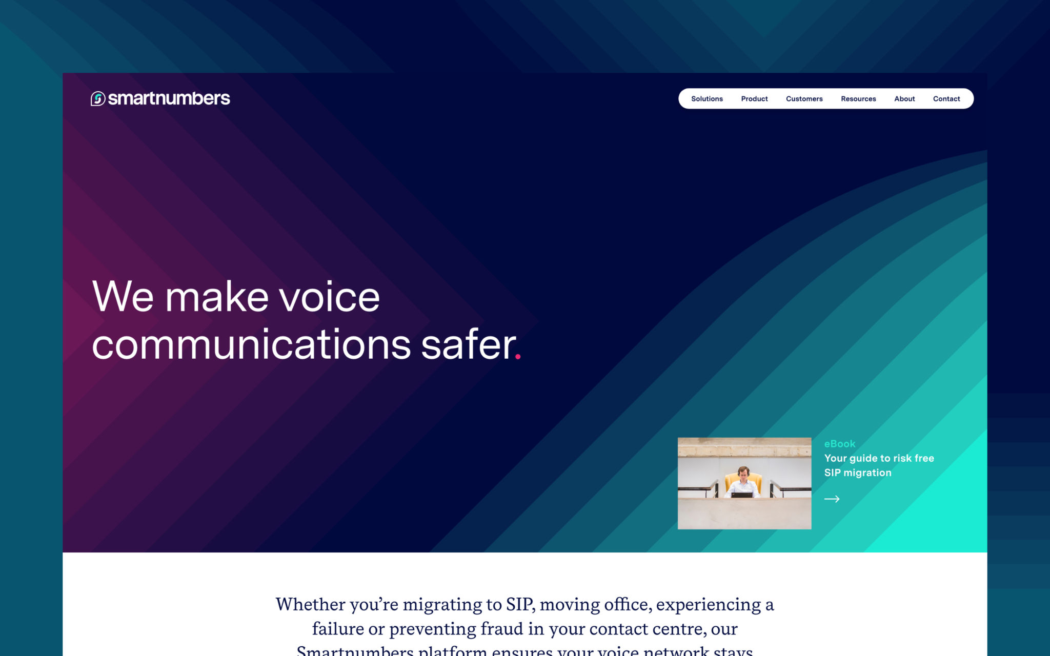
At Smartnumbers, our purpose has always been about making voice communications safer. We are a software company with a telecommunications pedigree. We create market-leading voice resilience, security, and compliance solutions at a time when voice is the most critical channel of communication. It’s why more than a thousand organisations trust us.
Yet, Smartnumbers is one of the industry’s best-kept secrets.
Today that changes. Today, we unveil our new brand.
Bold brand shapes
You’ll see several shapes used throughout our brand that represent the core aspects of Smartnumbers.
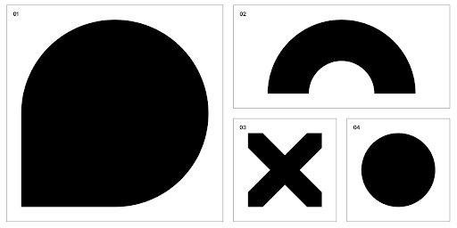
The chat bubble/balloon signals to the very essence of what we do: voice communications. It’s also an abstraction of a padlock to represent the reliability and security that Smartnumbers provides.
The semi-circle is representative of the call itself. It’s making a connection, a path, it’s a nod to our call routing capability.
The X illustrates our capability to detect suspicious callers. Be that to prevent contact centre fraud or to streamline authentication, Smartnumbers catches bad actors before you answer the call.
The circle/dot is inspired by the traditional red recording dot. We also use the dot at the end of a statement to add gravitas. We put a stop to fraud, full stop.
Bold brand colours
The vibrance of our new colour stands out, it’s modern and makes a bold statement.

Smartnumbers Bright Turquoise. This vibrant greenish-blue colour represents resilience, trust and safety.
Smartnumbers Amaranth. This intense colour represents the bad actors and fraudulent callers which we identify in the network. It also evokes the traditional red recording dot.
Smartnumbers Deep Blue: A dark colour we use for fonts and backgrounds to make our primary colours really stand out. The blue represents trust and pays homage to our previous branding colour.
Putting it all together we get:

Our agency partner
A big shoutout to Branch Road, our design and content agency, who partnered with us to develop our new identity. Branch Road worked with us to match our bold purpose with a distinct brand identity.
Under the fancy new look
While our identity has changed, we’re still the same approachable, customer-focused organisation, committed to making voice communications safer.
